I think its good to sometimes stretch yourself with your art . . . and starting a project with colors rather than the image is definitely a stretch.
Its easy to start with imagery and pick the right colors. Its more challenging to reverse the process and start with colors and then try choose the imagery.
The February trio of colors is: Soft Sea Foam,
Mossy Meadow and Poppy Parade.
Mossy Meadow and Poppy Parade.
Two greens and a red?
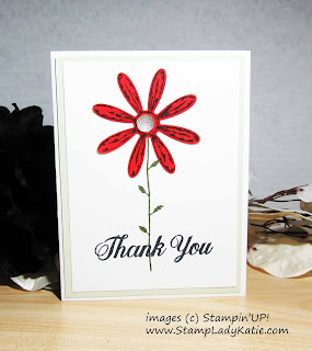
I like the contrast of the colors, but felt kind of like I was cheating, like there wasn't enough of the 2 greens. So I stepped it up a bit with a 2nd card. The flower on both cards was stamped on the Poppy Parade paper and punched out with the Daisy Punch.
The difference on this 2nd card is that I stamped the leaves on the Mossy Meadow and "fussy cut" them with a scissors. I then glued them over the leaves on stamped stem. I really like the addition of the extra splash of dark green contrasted with the brightness of the flower.
I'm not sure how well you can see the sparkle on the petals. I went around the edges of each petal and down the center with the Wink of Stella pen. It really adds a finished look to the flower.
And then because you can never have too much sparkle (right?), I also traced over the letters in the sentiment with the Wink of Stella pen. Its subtle, but very effective.
Thanks for hopping by. When you have time, you may enjoy browsing my blog for more ideas. Be sure to check out all the great projects in our February Color Challenge Blog Hop. Click this button to see Astrid's creation.
- Sandra Roberts - (UK)
- Sue McDonald - (UK)
- Janey Backer - (US)
- Lauren Meiklejohn - (Aust)
- Silke Trapani - (DE)
- Jo Blackman - (UK)
- Laura Mackie - (UK)
- Angélique Nederpel - (NL)
- Rebecca-Jo Unwin - (Australia)
- Carmen Groinig - (Austria)
- Tracy Marie Lewis - (US)
- Brigitte Baier-Moser - (AT)
- Astrid Hofmann (AT)
- Tatiana Grübler (DE)
- Angela Köber (DE)
- Cheryl Taylor (UK)
- AnastasiaRadloff (US)
I hope I've inspired
you to add a little shine to your next project. The Wink of Stella pen is amazing and the Daisy Delight stamp set and Daisy Punch are a really versatile combo. I'm happy to answer questions about this or
any other project. My email is in the header at the top of the page.

If you haven't browsed the Stampin'UP! store
I encourage you to spend a little time there. This is a great company
with wonderful product. I do receive commission on sales and I
appreciate your business - thank-you. My commission is paid by the
company, you pay nothing extra when purchasing product through me.
Because I do appreciate your business, you can earn extra rewards when you shop with me
Just be sure to use the Rewards Code for the month (found in the left pane of the blog) when you place your on-line order.
Because I do appreciate your business, you can earn extra rewards when you shop with me
Just be sure to use the Rewards Code for the month (found in the left pane of the blog) when you place your on-line order.
Links by TheseAreMyStamps.com


8 comments:
A great BlogHop project! Thank you for the inspiration.
Until the next BlogHop.
Greetings from Leipzig.
Rene
http://Stempeln-mit-Rene.de
Both are pretty. I like the big red poppy with the bead center. I think I like the 2nd card best with the bigger leaves. Thanks for pointing out how you cut them out and glue them on. I don't think I'd have thought to do that.
I like the clean look to both cards, but do like the larger leaves on the second card. WoS is so hard to capture in an image, Great job on your lettering image showing it! TFS
Hello Katie! I love the sparkling very much. It's the details that make the whole thing special!
Kind regards! Brigitte
Wonderful clean and simple card designs. I love the way you have used these colors. :)
A great Card! Thanks for the inspiration.
Dear greetings
Silke
So simple, but so beautiful they are, both of your cards...
wonderful clean card! TFS Regards, Doro
Post a Comment